


Gray walls look easy until you hang the curtains. A pair that looked crisp on the website suddenly turns muddy, purple, or oddly yellow once the curtain hangs next to your paint. The curtain is rarely the problem. The gray's undertone usually is.
Before writing this, I read through most of the pages ranking for this topic. Almost all of them hand you a list of 10 to 16 colors and stop there. That list isn't wrong, but it skips the one step that decides whether any of those colors will work in your room. And that is to identify the undertone of the gray walls. This guide starts with that step, then moves to the colors, including a few I would skip.
Check Your Gray's Undertone First
Gray is never just gray. It leans cool (blue, green, or violet), warm (beige or brown), or sits close to neutral. A curtain color that looks deliberate against a cool gray can look dirty against a warm one.
The quickest test needs a sheet of plain white printer paper. Tape it to the wall in daylight and look at the gray beside it. If the wall suddenly looks bluish, it's cool. If it looks tan or slightly pink, it's warm. Repeat this twice, once around 10 a.m. and once near 6 p.m., because the color can look different at different times. A north-facing room tends to push gray cooler, and warm 2700K evening bulbs push it the other way. Researchers at Hamadan University of Medical Sciences found that cool white light made colored room surfaces look less warm and brighter than warm light did, which is why the same gray can look different under your lamps than at your window.
One thing I'd like to flag: many paint chips labeled gray are actually greige, gray with a heavy beige lean. If that's your wall, our guide to curtain colors for beige walls applies almost one-to-one. If your gray reads blue next to the paper, it behaves more like the walls we covered in curtain colors for blue walls, so that one is worth a look too.
The Curtain Colors That Work on Gray Walls
Ivory or Soft White for Cool Gray
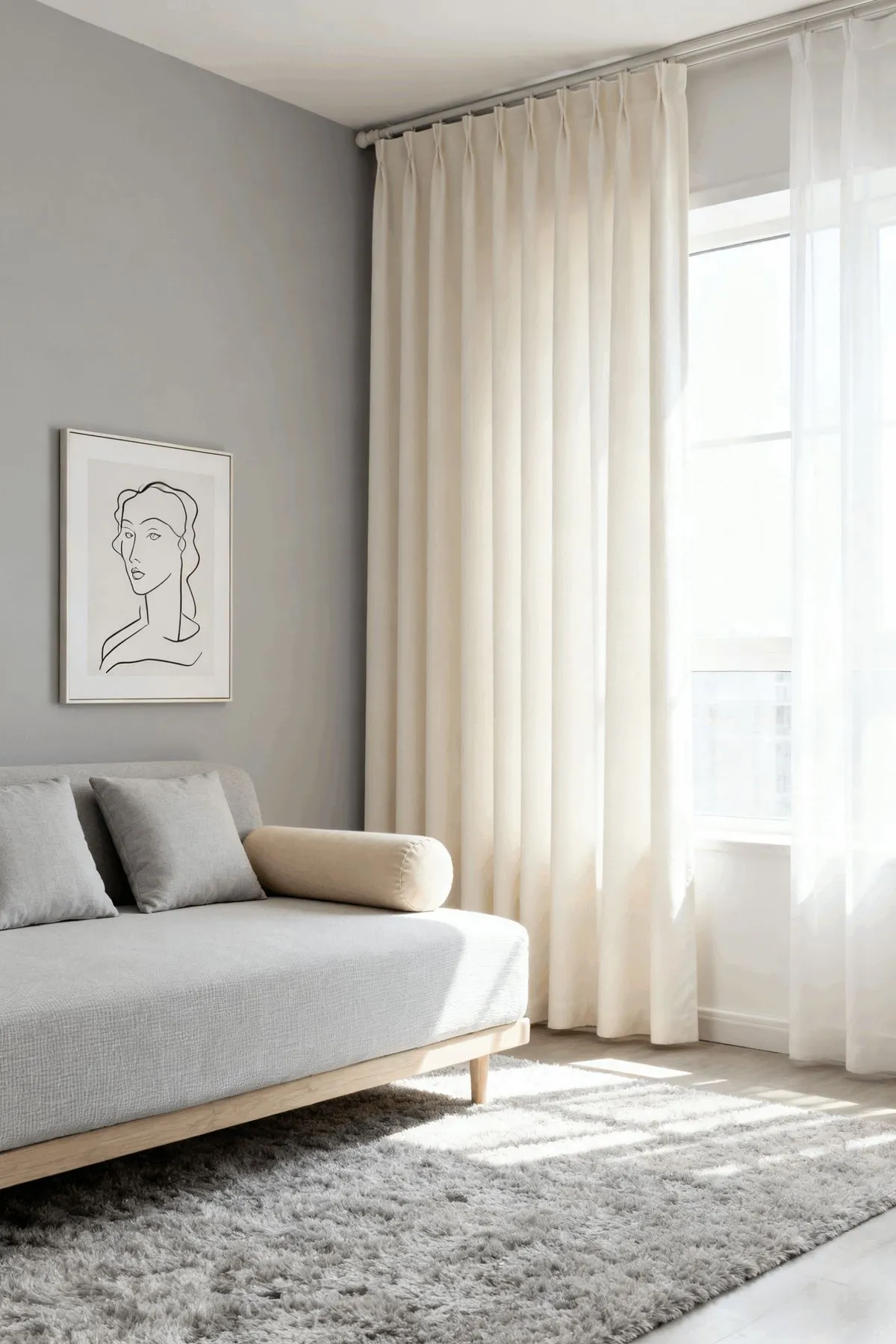
Skip stark, bluish white here. A warm ivory takes the chill off without making the room feel beige. I think this is the safest pick on the list, and also the most boring one, so use it when you want the room to stay quiet.
Oatmeal, Tan, or Greige Linen for Warm Gray

These share the wall's undertone, so neither competes with the other. The tradeoff is that the whole room can go flat, so I'd add texture through the weave rather than color.
Navy for Light Gray

Navy against light or mid gray is the pairing designers keep coming back to, and it earns it. However, against charcoal walls, the navy nearly disappears at night, so that I wouldn't use it there.
Mustard or Ochre for Cool Gray

This is the strongest fix for a cool gray room that feels cold. Keep it muted. A bright lemon yellow next to gray tends to look like a school hallway.
Deep Green for Medium Gray
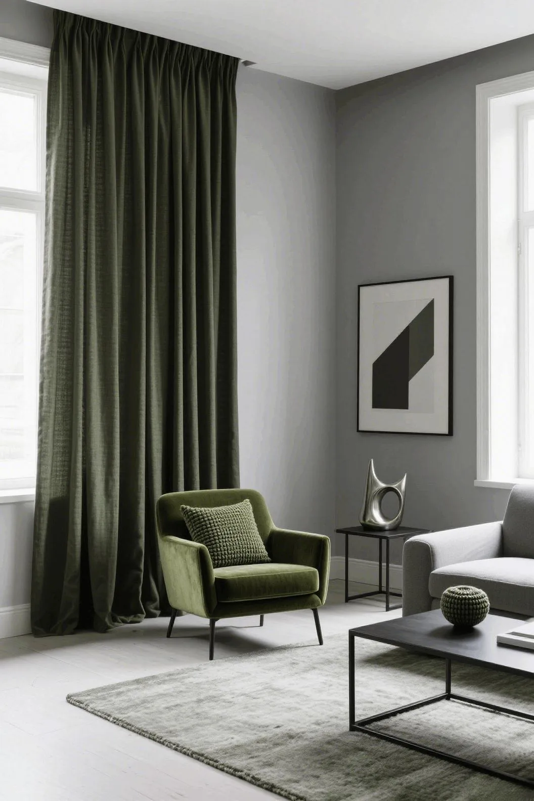
Forest or deep olive adds warmth and depth. It works best in a bedroom or living room with real daylight. In a dim room, it turns almost black.
Charcoal, Tone-on-Tone
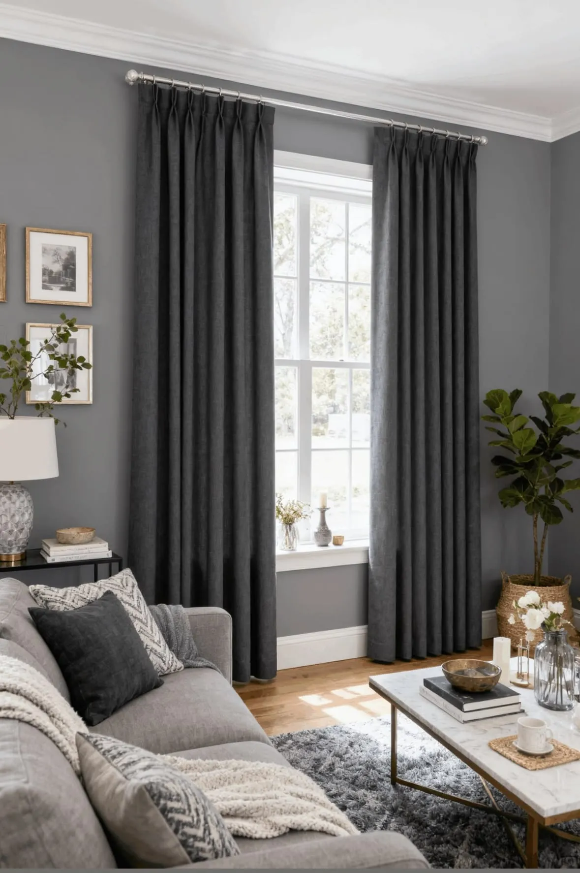
Darker gray curtains on lighter gray walls look calm and layered, especially in a modern or loft-style space. It's a good choice if you don't want a color decision at all.
I tried white curtains with cool gray walls in my study room, and it looked like heaven. I loved reading my favorite book there with a sip of coffee. Gray and white extended an ethereal ambiance.
Colors That Disappoint on Gray (and a Few Edge Cases)
Not every popular suggestion holds up. These are the ones I'd think twice before implementing.
- Lavender on Warm Gray: Lavender is often recommended for gray, and it does look dreamy on a cool gray in a bedroom. On warm gray, it looks muddy and slightly brown.
- Sage or Gray-Green at the Same Depth as the Wall: The two blur together, and the window area looks washed out.
- Shiny Silver or Gray Satin: It reads cold, and in a room with cool LED bulbs it can look like a hospital curtain.
- Black in a Small Room: It can look striking in a big living room. In a small, dim bedroom, it makes the window wall feel like a box.
- Pure Bright White on Warm Gray: Next to a warm gray, the white can look slightly blue and harsh. Ivory is kinder.
One edge case worth knowing: if your gray wall is very dark, pale curtains can look like a hole of light in the wall. A mid-tone in the same family often looks more settled than going to either extreme.
Type of Fabric, Amount of Light, and Lining Change the Color You See
The same hex code looks different on linen, velvet, and sheer. Linen scatters light and looks softer. Velvet absorbs it, so a navy velvet reads far deeper than navy cotton. Sheers glow in daylight and turn almost invisible at night, so I'd never rely on sheer alone for color.
Lining matters more than most guides admit. An unlined pale curtain lets daylight through and shifts toward the sun's color. A lined one shows its true tone and hangs fuller, which also makes the color read richer. If a window gets hard in the afternoon sun, a lined panel is the one I'd pick, even in a light color.
Size matters too. Panels hung at roughly twice the window width look full and expensive. Flat, narrow panels make even a great color look cheap.
Before you buy, order swatches and tape them to the wall for at least three days. Check them in morning light, afternoon light, and under your lamps at night. If you want a method for judging a palette across a whole room, our guide on visualizing color schemes for home decor walks you through it. A swatch that looks wrong on day one sometimes looks right on day three, and the reverse happens just as often.
Final Takeaway
Match the undertone of the gray walls and then choose the curtain accordingly. Ivory and oatmeal are the low-risk picks, navy and mustard are the confident ones, and the colors in the "disappoint" list above are the ones I'd test on the wall before paying for a full set. Tape up swatches this weekend, look at them at night, and decide on day three.